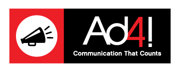
Although the brand promise of Ad4! Group has always been the same, Ad4! has enjoyed over 10 years of evolution of the Ad4! logo in the Huntsville, Alabama market. Enjoy the following history of symbols that have represented and sustained Ad4! since 2004.

2004: The original logo.Looking back, this one makes us smile. Felica had just started Ad4! and was thinking about her circus of talents. The designer came up with this look and it worked fine for a few months until she started to get real business. At that point, Fle’s Circus of Talents evolved into the Ad4! Group . . .

2004: The first Ad4! logo.Tagline: Ad4! Group, Good 4 Business
The second logo in the Ad4! series, but the first to use the legal name, Ad4! The intent for the brand, symbolic development was to offer great services, provided by highly seasoned talent for affordable prices. If you add one or all of our main 4 lines of service, you will have success.

2006: The second logo in the Ad4! series.Tagline: Ad4! Group, Good 4 Business
As you can see, this logo took on a new color scheme. We kept what would become the signature black, but added gold, to give a more “successful” impression to the mark. Additionally, we added a globe symbol to indicate that we were more than just a local firm. Indeed, Ad4! was now a global in its reach. The mark also took on a formality that would last for several years.

2011: This is the 2009 Ad4! logo.Tagline: Ad4! Group, Success 4 Business
In developing this logo, we want to go back to simple look and feel, still maintaining our brand integrity, but using current fonts and moving back to our original colors. Plus, that year, gray seemed to be very hip…plus the dots were a nice touch.

2012: The Ad4! grunge logo.Tagline: Communication That Counts
This logo set us on a new format. With the popularity of social media, we needed a logo with a square ‘widget’ that would represent us in profiles. The logo itself is formatted in a landscape mode making it less than ideal for avatar placement. But the square megaphone widget is ideal for social media and would become a symbol for the Ad4! brand.
Our concentration on effective communication in all aspects of work, from branding to marketing strategies, caused a change in the tagline;Communication That Counts in everything we do.

2013: The current form of the logo.Tagline: Communication That Counts
This look was cleaner and more elegant for our new websites. The bullhorn widget was replaced with the megaphone. The flat design and clean red and black colors better work with our clean web design. While we liked the grunge look of Karen’s 2012 design, we really like this clean look, and somehow the megaphone feels better than the bullhorn.

2014: The 10-Year Anniversary logoTagline: Communication That Counts
This is the 10-year anniversary tweak to the 2013 Ad4! logo. We’re using it on our business cards, but continue with the clean 2013 logo for our website and letterhead applications.
For help or more information on how AD4! group can help you with your logos or rebranding check out our Logo Design services. Or, if you need help with your marketing and branding for your business, feel free to contact us today!
Originally published on: Sept 13, 2016
