It seems that everyone wants a brand these days. They want this brand – both personal and professional – to stand above the rest, be noticed, and be their calling card for success.
All of that sounds wonderful, and, for the most part, it’s not too lofty a goal, unless that brand doesn’t quite live up to its potential. It’s all too easy to fall into that trap when the brands lack identity and character as a result of poor font and color choices.
Consider the iconic brands that have withstood the tests of time: Coca-Cola, for instance, with its bold font script on its perfectly hued red background. This brand is easily the most identifiable on the planet at the moment and has been since the 1980s. That doesn’t happen by chance, of course. The same amount of thought should go into developing the brand of even the smallest of businesses.
My advice to clients is to begin with The Pantone Color Institute. Pantone is the arbiter of colors, choosing each year, a color to designate the look and feel of this particular moment in time. In 2019, their team of forecasters has already predicted that it’s fetish foods, such as macarons and berries, which are dictating the color palate we’re already seeing spring up in the fashion and home design magazines. In 2018, the Color of the Year was Ultra Violet, a deep, purplish-blue hue.
Pantone, which is based in New Jersey, has been at the forefront of this kind of forecasting for decades. Take note of the trends Pantone is seeing and allow that to help guide and direct your decisions regarding colors as part of your brand and overall design.
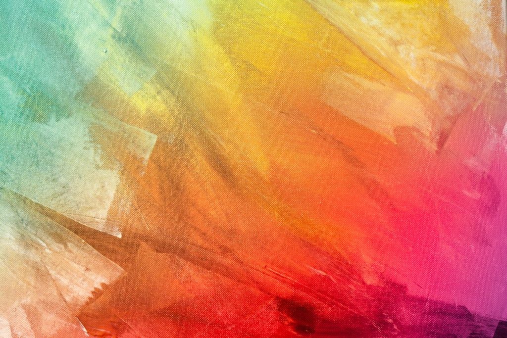
Secondly, consider how colors make you feel. Much work has been done in the social sciences related to color and the emotions it connotes. It’s likely you’ve even heard or been exposed to them. Red tends to inspire a sense of hunger and activity. Blues tend toward calmer colors. Ever had to paint a nursery for a newborn? It’s likely you’ve chosen something that made you, and in turn, the baby, feel peaceful and relaxed.
Colors are no different when being considered for something as important and as overarching as a brand. This brand will be a part of everything, from you letterhead and website, to promotions items, including those that can be worn, to billboards and business cards. If you don’t like the colors, it’s likely that your potential clients or customers won’t, either. Choose this carefully.
It’s no surprise, then, that the color wheel is consulted at the highest of brand levels to determine just how individuals react to certain colors and why certain industries gravitate toward certain colors. Healthcare, for instance, often uses blues and greens as part of their overall branding efforts. Both colors have a history of connoting peace and healing. Consider the very simple yet effective blue cross of Blue Cross/Blue Shield. Fast-food chains tend toward the more primary colors in the palate, the reds and oranges and yellows. These colors often spark a sense of lively activity and, as mentioned, hunger pangs as well.
Before we leave the topic of color, consider minimizing the number of colors in the final brand product, especially if you know you’re going to be using the brand in its full-color iteration. Any more than four colors as part of the brand and printing fees, as well as those for embroidering the brand on wearable items, can become cost-prohibitive.
Once your color selection is made, however, make sure to note and save the Pantone color numbers in both the covered and uncovered formulas. Having this information will ensure that your brand will be printed the same every time. It’s a critically important step of keeping your brand and your image consistent.
As important as the color selection is to the process of branding, font choice is equally as important. Too often, I see brands in which the font is too difficult to read, especially when reproduced for something as large as a billboard or as small as a business card. And, just like colors, font styles are not immune to the effects of time. Old English certainly has a place in many formats, but it’s not likely it’s going to be used very often in branding outside of what you might see to advertise the local Renaissance Faire.
Sans serif fonts, those without feet, that is, are enjoying a bit of a revival these days. The sans serif font you’re probably most familiar with is Helvetica. This font was co-opted by a number of large organizations, including the federal government and metropolitan transit authorities, in order to advertise their services. It was chosen largely because it’s easy to read regardless of how it’s reproduced. While Helvetica is a good font, others that are sans serif, such as Century Gothic, are also making a rebirth because of how clean and contemporary they appear to the reader. Both of these fonts are modern and reproduce easily, and it’s tempting to use them time and again.
Serif fonts, or those with feet, are often used in more professional areas. Times New Roman is probably the most familiar or the serif fonts. This is the font of choice for most printed news media, including The New York Times. Its readability, even at a relatively small 10-point and 12-point size, make it an excellent use for large-scale printed jobs that are heavy on fonts. For branding purposes, however, it should be noted that this is a heavier, more traditional font. Its use in a brand should be dictated by the type of business being considered. Financial institutions, institutions of higher education, and municipalities tend toward the use of serif fonts in their brands.
As a final word on fonts, avoid using trendy fonts in your brand. Trendy fonts become dated very quickly and include ones you’re probably familiar with, such as Brush, Comic Sans, and Bauhaus. Using one of these will also tend to date your brand and its ability to stay relevant.
Of course, Ad4! is here to assist you through the development of you brand, offering you the best advice on colors and fonts that will work the best for you. Let us grow with you!